
UNMARKOBLE started as a personal brand, but I did not want it to feel like a logo placed on top of my work. I wanted it to feel like the system behind the work: how I think, how I edit, how I connect design with engineering, and how I try to make ideas sharper before they become public.
My name is Marko, so the name had to carry that somewhere inside it. UNMARKOBLE has Marko hidden in the middle, but it also sounds close to unremarkable. I liked that contradiction. On the surface, unremarkable means something ordinary, something that passes by without being noticed. The brand flips that feeling into a challenge: if the work is clear enough, even a quiet mark can become impossible to ignore.
The live UNMARKOBLE page sits at /unmarkoble, while my personal profile lives at Marko Andrić. I want search engines and people to understand the same relationship: UNMARKOBLE is the creative direction system, and Marko Andrić is the person building it.
The Story Behind Unmarkable
There is a trace you leave on the world, and there is a trace the world tries to impose on you.
The word mark means a sign — something that defines you, something people recognize you by. But before Marko became a name, mark was just a symbol: a sign, a stamp, proof that something existed.
Then comes un-.
Not as negation, but as liberation.
Unmarked means unlabeled. Without a tag. Without a pre-written story. Without a box others can put you in.
From that idea comes Unmarkable.
Not as a dictionary word, but as a stance.
It means: you cannot define me with one word. You cannot categorize me. You cannot slap a label on me and think you know me.
Someone will try to describe you by what you were yesterday. Someone will try to limit you by what they see today. But some people are not made to be just one thing.
They change. They grow. They write their own story.
So Unmarkable is not "without a trace."
On the contrary.
It is a person who does not wear other people's labels — but chooses what kind of trace they leave.
The Idea
I did not want a personal brand that only says "creative". I wanted something more disciplined. The mark had to feel like a product system, a stamp, a corner, a signal, and a small architectural object at the same time.

That is why the logo is built from a simple tension: a rounded outside shape and a strict inner square. The radius gives it motion and softness. The square gives it structure. The open corner makes it feel unfinished in the right way, like the brand is always leaving space for the next project. It is not trying to fit perfectly into the mold; it keeps the discipline of the mold while quietly outgrowing it.
The Blueprint
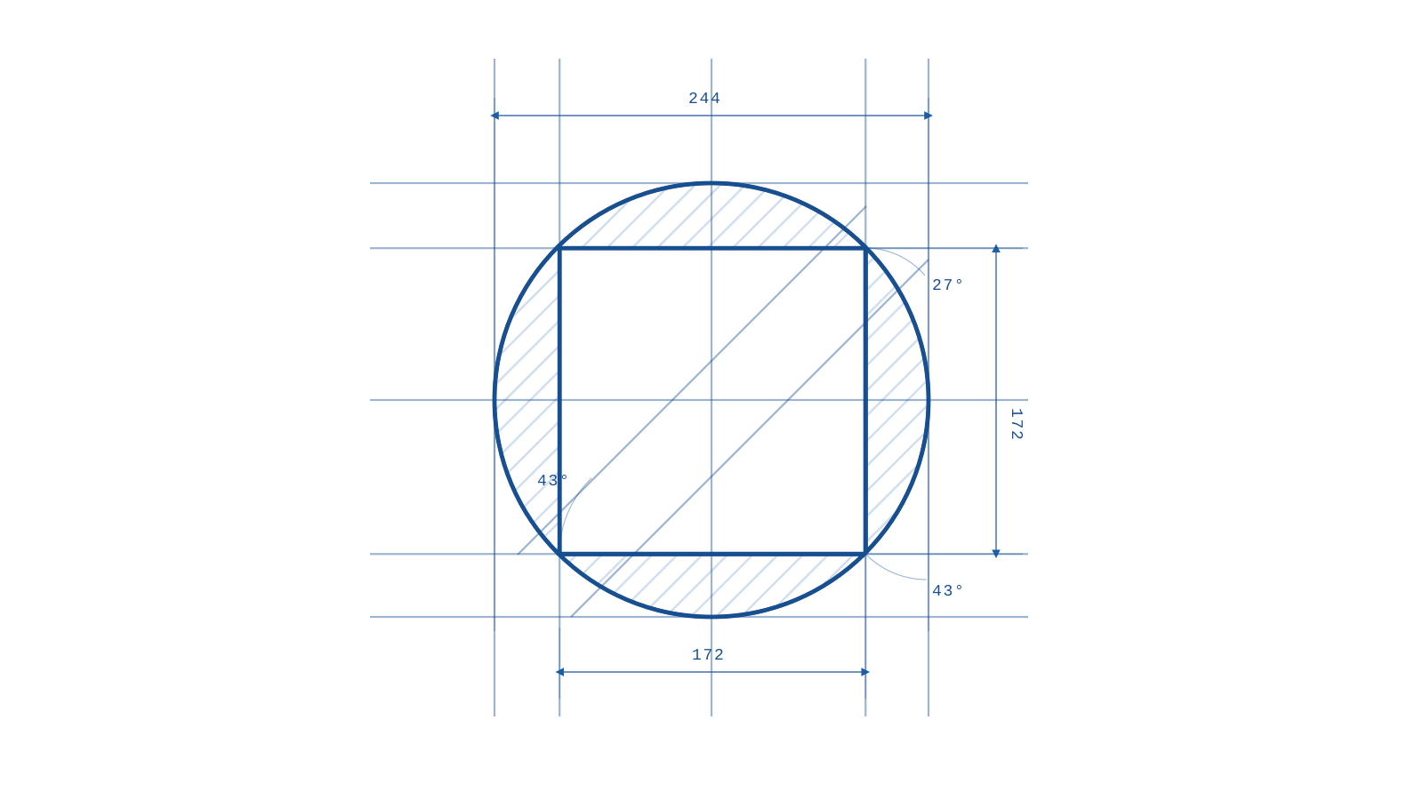
I treated the mark like a blueprint, but only where the lines actually mean something: the outer radius, the square mold, the negative space, and the open corner. I did not want construction lines as decoration. The whole point is that the mark has a frame, understands the frame, and still does not fully behave inside it.
The radius matters because it keeps the mark human. The inner square matters because it keeps the mark exact. The negative space matters because that is where the name works best: Marko inside unremarkable, personality inside restraint, creative instinct inside engineering logic.
What I Was Building
UNMARKOBLE is the place where I can present creative direction without separating it from software, product, and strategy. I study software engineering, so I naturally think in systems: dependencies, inputs, weak points, loops, and scale. But I also care about taste, story, and the first emotional signal people get from a project.
That mix is the point. I do not want to be only the person who makes something look better after it is already built. I want to help define what the thing means before the visuals, product, copy, and launch start pulling in different directions.
Why It Fits Me
The name is a small joke, but also a serious rule. I do not need everything to be loud. I need it to be clear. I need it to carry a reason. I need the work to feel like someone actually made decisions.
That is the philosophy behind UNMARKOBLE: a personal brand for making projects feel less generic, less accidental, and more like they know why they exist.
See the full brand page at UNMARKOBLE, the personal profile at Marko Andrić, and related proof of work in PISTA and SIDE LINE.