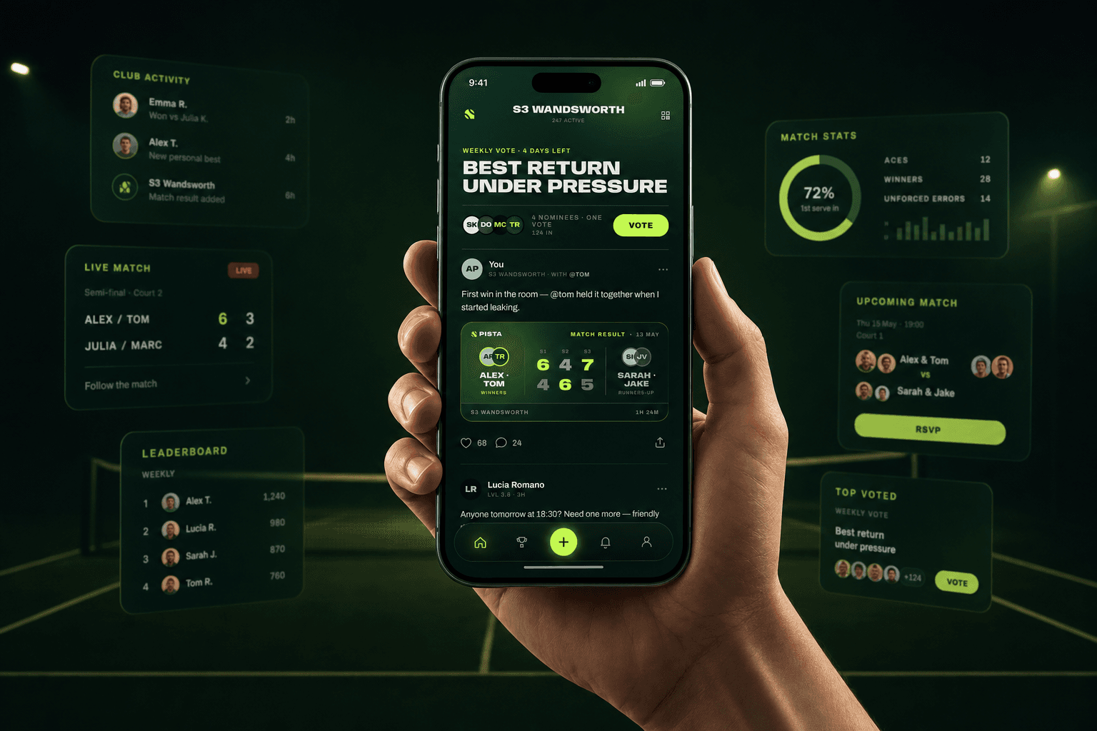
PISTA started from a simple feeling: sport is not only the match. It is the pressure before the first serve, the story people tell after it, the small rivalries, the group chats, the jokes, the result card, and the people around the court who make it feel alive.
I worked on Pista as CTO and Creative Director, which meant the job was not split cleanly between product and visuals. The product had to work, but it also had to feel like the culture around the sport. A basic match tracker would not be enough. The app needed the same energy people already bring to padel and tennis: competitive, social, quick, and a little dramatic.
The Product Idea
The core idea was to turn local racket-sport communities into something people could open every day. Matches become posts. Results become social objects. Weekly votes give people a reason to come back. A club stops being just a schedule and becomes a feed with names, stories, rankings, and moments.
That is why the screen is built around pressure instead of admin. The hero vote, the match result card, the comments, the active community label, and the bottom action all point to one thing: this is a sports app that behaves like a social space.
The Touch Glass Concept
The brand idea I kept coming back to was Touch Glass.
It works as a twist on "touch grass", but it belongs completely to padel. A padel court is surrounded by glass. You are literally stepping inside a transparent box, with people watching, the ball coming back at strange angles, and every mistake staying visible for a second longer than you want it to.
That became the useful contradiction behind Pista: you enter the box to get out of yours.
The court became a metaphor for leaving the comfort zone. Pista was not only about finding a match or recording a score. It was about creating small social triggers that move people forward: accept a challenge, join a game with someone new, post a result, vote, climb a ranking, come back next week, and slowly become more comfortable with pressure.
Community, matchmaking, and gamification were not separate features in that vision. They were different ways of making personal progress feel social, visible, and easier to start. The app gives people an excuse to meet, compete, improve, and step into situations they might usually avoid.
In that sense, Pista was a universe for personal growth through sport. The glass court gives the pressure a shape. The community gives that pressure energy. The product turns it into a loop people can return to.
Touch Glass. Enter the box. Get out of yours.
The Creative Direction
The visual language had to feel like the court at night: dark, sharp, green, high-contrast, and a bit electric. The lime color is not just decoration. It carries the feeling of a ball, a floodlight, a score changing, a notification hitting at the right moment.
I wanted the interface to feel more like a sports broadcast than a neutral utility app. Big type, compressed headlines, compact result cards, and small social signals all make the app feel active before the user even taps anything.
The logo follows that same rule. It is wide, fast, and heavy, with a mark that feels closer to motion on court than to a static app icon. The typography gives the product a broadcast-like voice before the UI starts explaining itself.
What I Was Solving
The challenge was balance. Too much product logic and the app becomes a spreadsheet for matches. Too much visual energy and it becomes hard to use. The right version sits in the middle: clear enough to understand fast, expressive enough to make the community feel real.
That is also why Pista was an important project for me. It brought together the parts of work I care about most: product strategy, technical architecture, interface design, brand feeling, and the discipline of shipping something that can grow beyond one nice-looking screen.
Pista is not just about recording who won. It is about giving the court a place to keep talking after the point is over.
This project is part of the UNMARKOBLE creative direction portfolio by Marko Andrić, alongside the UNMARKOBLE brand blueprint.